CDW Mobile Navigation
Taking into account recent taxonomy updates to the CDW.com desktop navigation, I was tasked with wireframing a mobile parity while also considering mobile best practices.
FOCUS
Competitive Analysis
Wireframing
Prototyping
Interface Design
The company
CDW.com is an eCommerce platform offering not only technology products, but solutions and services for business, government, and education segments.
The context
As the designers on CDW’s Product Find team worked to deliver a new desktop navigation, including a taxonomy reassessment and a category merge, they tasked the overarching design team with generating concepts for a global mobile navigation. Considering the same taxonomy recommendations and updated global categories, the mobile navigation is intended to be a parity of the newly updated desktop navigation.
Understanding the problem
As it exists currently, the mobile navigation on CDW.com provides an inconsistent experience from desktop, and lacks convenient navigation to a number of site areas. Products, services and solutions that cannot be found through the mobile website decreases profitability and trust in CDW as a brand and provider of IT products and solutions.
PAIN POINT 1 The mobile navigation is not clear or intuitive.
What users can do through one global navigation on desktop, they must use two menus for on mobile. It is unclear where to find each of the global categories.
PAIN POINT 2 There is little to no recovery when users navigate to certain pages on the site.
If users click through a certain funnel from the mobile homepage, they will no longer be able to access the secondary navigation that pushes access to the more content-based site areas.
PAIN POINT 3 The mobile and desktop experiences are incredibly disjointed.
The content in the existing mobile navigation is scattered and disorganized. There is a lack of consistency in the way content is grouped across desktop and mobile.
Defining priorities
In order to align more closely with the newly updated desktop navigation, the design team established a list of priorities for the mobile design. Ideally, a cohesive navigation across mobile and desktop will help drive customer confidence and loyalty, and allow for a seamless purchasing experience.
PRIORITY 1 Give focus to the L1 and L2 navigation.
The design brief prioritized Global, L1, and L2 elements, and deprioritized the L3 elements that are presently listed in the desktop navigation.
PRIORITY 2 Include search.
As search is one of the primary user actions on desktop, it was important to include a fairly prominent search function on mobile.
PRIORITY 3 Include account center utility navigation.
A key feature of the desktop global navigation, the account center utility navigation was also requested for mobile.
Discovery
Considering a variety of brands, both analogous and unrelated, I compiled examples of mobile navigations that showcased similar combinations of features. In particular, I paid close attention to the location and interaction patterns of search and main menu items.
UX Considerations
PRIORITY 1 Give focus to the L1 and L2 navigation.
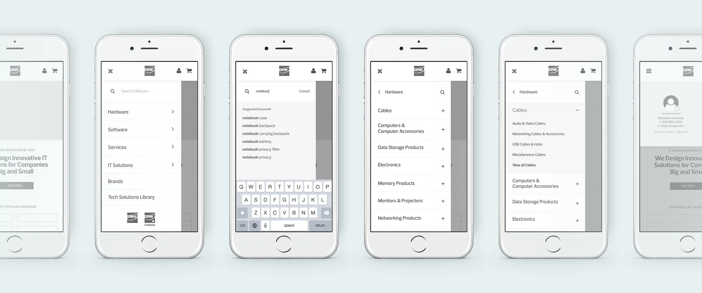
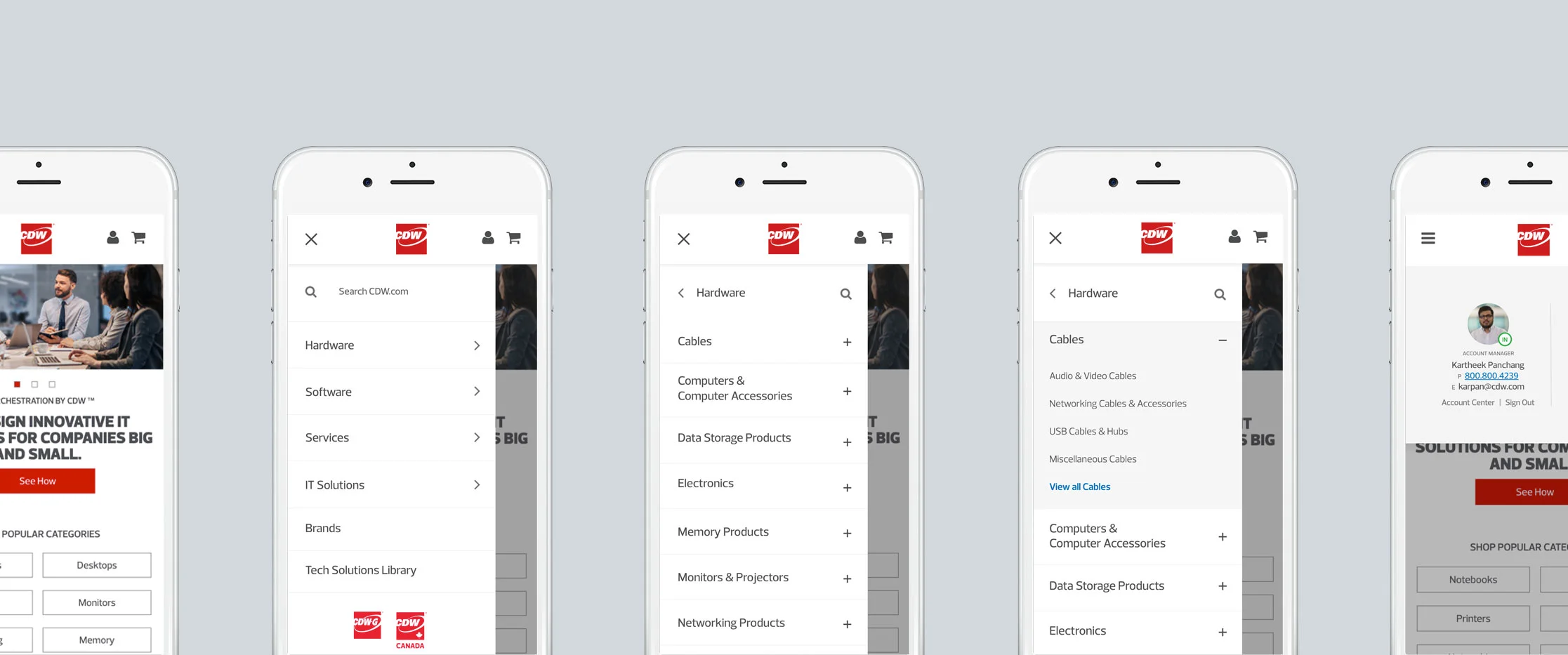
DESIGN SOLUTION Instead of moving the user through multiple layers of drawers, I chose to use one drawer between the Global and L1 elements, and nest the L2 elements in the accordion. This approach aimed to keep the user oriented through the multiple navigation levels.
PRIORITY 2 Include search.
DESIGN SOLUTION To eliminate the number of items in the top navigation and keep the design simplified, I included the search feature in the hamburger menu on top of the Global categories. The search function remains persistent throughout the progression.
PRIORITY 3 Include account center utility navigation.
DESIGN SOLUTION To avoid taking the user away from the shopping journey, I included the Sign In in a layer alongside links to important account features. If the user is signed out, the links will prompt sign in. If the user is signed in, the user’s account manager will appear with contact information and the options to go to the full Account Center experience or sign out.
The prototype
With the application of UI, I considered existing styles across desktop and mobile versions of CDW, as well as existing visual patterns across other sites. To address compliance standards, I also considered color contrast and link clarity.


